Showing posts with label school. Show all posts
Showing posts with label school. Show all posts
Friday, 29 April 2016
Hand In Magazine Feedback
This is the feedback I have received for my magazine from my target audience.

Monday, 21 March 2016
Double Page Fifth Edit

Thursday, 17 March 2016
Final Article
I have redrafted my article and here is the finalized text:
Who: Gh0stWhat: Musician, entrepreneur, director and all round cool girl
Song That Changed Her Life: Stairway To Heaven, Led Zeppelin
Favourite Movie: Vertigo
Netflix Binge Pick: Twin Peaks
Style Icon: Courtney Love
If you haven’t been living under an extremely soundproof rock for the past year then you’ve probably heard of Gh0st, but for those who do happen to habitate on a desert island with no forms of communication she’s the strong female artist rocking the alternative scene who’s known by close friends as Katie. She’s the hot new female artist who stunned the world in 2015 when she dropped her new album ‘Game Over’ which went straight to number one with sales of over 7.5 million (even topping pop favourite Adele with her album ‘25’).
The Techno, Indie, Grime queen writes and produces all her own music as well as directing and acting in all her videos all the while running her own recording label “Oblivion Records”. Her life is viewed by millions via her famous instagram page but she wants you to know that it’s not all fun and games being a star.
When meeting Gh0st you’ll first notice her one-of-a-kind, stylish dress sense. It’s sort of a mix between a 1980’s cartoon character and an alien, combined with the iconic style similar to that of (dare I say) Elizabeth Taylor. Yes, she’s THAT cool! Everybody wants to be her, everybody wants to be with her but she says she’s “totally over that. This whole prestige that comes with fame, it’s just a concept, it’s not physical it’s just counterfeit, unreal.”
Her fame all started with her release of her 2014 single ‘Virtue’ which she said she “Didn’t expect to take off so fast” according to the idol herself, record labels were turning her down because her music was “too artsy”. When asked by Cult! how she felt about this she replied “Well it’s just fucking degrading, you put all your shit out there, you know, in your music, in the lyrics, and then they turn around and tell you it’s too much! It makes you feel mad, it made me feel like a crazy. But sucks to be them because I guess people like that openness they find in my music, I suppose it like resonates with them. It must be like a therapy session, you know, sharing your problems?”.
Her most recent album ‘Genesis’ gives an even more intimate look into her life and reveals about her past as a teenager. “It was hard growing up” she says as she sips on her coffee. She laughs, “I was a really bad kid so I don’t know why I’m laughing. I mean, everyone hated me, the teachers, the girls at school, the guys at school. I liked being bad, I liked messing up, I must have just wanted attention”. This rebellious streak however, seems to have worked in her favour. She produces music that completely defies conventions, and as for her music videos… well you’ll just have to see for yourself. The only way one can describe such a visual treat is a manga blade meets the millennial with an undertone of 80’s and 90’s nostalgia. It’s a combination which should be experienced by everyone!
This intrusive style is a running theme both in her music and her online life. Her face lights up as she informs me of how important it is to “share your problems”, and while the cannot be named record labels that turned her down apparently told her that it was ‘too much’ she says listeners “love it because in a world full of lies people just want to know the truth. It sounds a bit vague but I don’t want to pretend that I’m perfect or that everything is swell because life just isn’t like that”. She heaves out an annoyed sigh, “Life isn’t about rolling out of bed with a perfect face and throwing on size 0 jeans to wander around L.A in. It’s about falling out of bed with last night’s makeup on, with about one million pimples, a red, puffy, hungover face and dog breath. We shouldn’t be telling little girls and boys that they need to be perfect because perfection just doesn’t exist, it’s one big fat lie and I don’t want to lie to people”. You’ll see this notion on her Instagram ‘Gh0stbustaa’, sweaty tour buses, acne, dirty hair. She’s just a real woman, and she wants everyone to know what a real woman looks like.
According to Gh0st, her “fans are at the heart of the music”. She lives, works and breathes for her fans. “I just want them to know that you can do what you love and you should do what makes you happy” she says with a stunning grin on her face. She provides her devoted fans with a very personal instagram feed with which she posts hourly to present followers with an insight into the life of a musician, entrepreneur and director. “I love to show people what life’s really like on tour. There’s this idea that life on the road as a musician is cool, you know, sex, drugs and rock’n’roll, but there’s just no time. It’s more like cramped tour busses, smelly bathrooms and a lack of showers. It’s all worth it though, the shows bring me alive, it’s just magic on stage. It can’t even be put into words…”
And so with those very compelling final words; Katie (AKA Gh0st) takes a last sip of her coffee, grabs her nostalgic, 90’s backpack and flashes me a smile. A brash grin, the type a child would make after saying a swear word, rebellion with a streak of pride, a smile which perfectly summarises her attitude and work as a paradoxical mix of both the pretentious and an infectious, genuine down-to-earth attitude.
Wednesday, 9 March 2016
Target Audience Feedback: Contents and Double Page

Target Audience Feedback: Cover
Tuesday, 8 March 2016
Teacher Feedback

I have decided to sharpen the image on the contents page and change the page number fonts on my contents page.
I have decided to change the layout of my double page spread, change the font used on my double page spread and change the layout of the text boxes.
Monday, 7 March 2016
Contents Page Rough Cut
I have completed the rough cut stage of the magazine project and have added more images to the magazine and page numbers/titles underneath these images in order to appear more conventional to the alternative music magazine genre.

Friday, 4 March 2016
Double Page Second Edit
Having completed my article I have added it to the spread and also added a house style font to create a clear sense of brand identity.

Magazine Cover Second Edit
Today I decided to change the fonts
I previously placed on my magazine as I feel these better suit the rebellious
theme and tone to the magazine I wish to create, the font seams to jump out of
the page and scream at the readers. The font I used for the tagline has also
been changed as I feel the jagged, printing press look better reflects the
rebellious theme.


Article
The Article
Today I made the first draft of my article for my music magazine, it is an in an interview style based on a current existing artist knows as 'Grimes'.

Today I made the first draft of my article for my music magazine, it is an in an interview style based on a current existing artist knows as 'Grimes'.

So, here it is...
Who: Gh0stWhat: Musician, entrepreneur, director and all round cool girl
Song That Changed Her Life: Stairway To Heaven, Led Zeppelin
Favourite Movie: Vertigo
Netflix Binge Pick: Twin Peaks
Style Icon: Courtney Love
If you haven’t been living under an extremely soundproof rock for the past year then you’ve probably heard of Gh0st, but for those who do happen to habitate on a desert island with no forms of communication she’s the strong female artist rocking the alternative scene who’s known by close friends as Katie.
The Techno, Indie, Grime queen writes and produces all her own music as well as directing and acting in all her videos all the while running her own recording label “Oblivion Records”. Her life is viewed by millions via her famous instagram page but she wants you to know that it’s not all fun and games being a star.
Her fame all started with her release of her 2014 single ‘Virtue’ which she said she “Didn’t expect to take off so fast” according to the idol herself labels had turned her because her music was “too artsy”. When asked by Cult! how she felt about this she replied “Well it’s just fucking degrading, you put all your shit out there, you know, in your music, in the lyrics, and then they turn around and tell you it’s too much! It makes you feel mad, it made me feel like a crazy. But sucks to be them because I guess people like that openness they find in my music, I suppose it like resonates with them. It must be like a therapy session, you know, sharing your problems?”.
Her most recent album ‘Genesis’ gives an even more intimate look into her life and reveals about her past as a teenager. “It was hard growing up” she says as she sips on her coffee. She laughs, “I was a really bad kid so I don’t know why I’m laughing. I mean, everyone hated me, the teachers, the girls at school, the guys at school. I liked being bad, I liked messing up, I must have just wanted attention”.
When meeting Gh0st you’ll first notice her one-of-a-kind, stylish dress sense. It’s sort of a mix between a 1980’s cartoon character and an alien, combined with the iconic style similar to that of (dare I say) Elizabeth Taylor. Yes, she’s THAT cool! Everybody wants to be her, everybody wants to be with her but she says she’s “totally over that. This whole prestige that comes with fame, it’s just a concept, it’s not physical it’s just counterfeit, unreal.”
According to Gh0st, her “fans are at the heart of the music”. She lives, works and breathes for her fans. “I just want them to know that you can do what you love and you should do what makes you happy” she says with a stunning grin on her face. She provides her devoted fans with a very personal Instagram feed with which she posts hourly to present followers with an insight into the life of a musician, entrepreneur and director. “I love to show people what life’s really like on tour. There’s this idea that life on the road as a musician is cool, you know, sex, drugs and rock’n’roll, but there’s just no time. It’s more like cramped tour buses, smelly bathrooms and a lack of showers. It’s all worth it though, the shows bring me alive, it’s just magic on stage. It can’t even be put into words…”
I have gained feedback from my teacher in order to improve it before placing it in my final cut:
- One more paragraph - how does she leave the interview?
- What are her final thoughts?
- Some kind of ending required?
Thursday, 3 March 2016
Contents Page First Edit
I have began the layout of my contents page using a clear house style with the front cover and an image of the artist who is featured on the cover.

Double Page Spread First Edit
I started creating my double page spread and having taken the images I have inserted it into an Indesign document I have also added a top and bottom bar both of which display the page number and magazine logo as I feel this creates a memorable house style.

Magazine Cover First Edit
Today I started work on the first draft
for my music magazine. Having planned the title of my magazine, the genre and
having looked at general conventions and stylistic choices of other alternative
music magazines I decided to go with an edgy punk style. After looking at my
audience research and existing music magazine styles (for example the pink
colour scheme used in the double page spread of NME) I thought the ironic girly
look and punk look (similar to many Dazed and Confused issues) suited the theme
of rebellious music and culture (hence why I chose the title CULT!). The bubble
font, I feel, also expresses this as it looks psychedelic.

Magazine Draft Drawing: Cover

Audience Research Data
I sent out the survey to 30 people and asked them to respond how they saw fit and this is their responses.


This is the contextual information that will help me understand the audience which I am addressing in the survey.

This information also helps me to understand the context of my audience as I understand the majority of the respondents have bought a music magazine in the past and so understand the codes and conventions of a music magazine when responding to the survey. The price question highlights that the majority of those asked would spend £3.00-£3.50 on a music magazine therefore the price of my own magazine will be £3.00-£3.50.


This data has helped to inform me of the colour scheme I should use in my magazine, with answers such as it being 'rebellious' and it 'standing out' and being 'defiant' it seems the scheme completely fits with the theme and tone I am aiming for therefore I have decided to have it as the house style colour scheme for my own magazine.

This data has confirmed the title which I had brainstormed as it seems the target audience also agree with it, while there is one example of negative feedback as it seems 'unusual' I have decided to ignore this as this 'unusual' and 'defiant' brand identity is the theme I am hoping to manufacture.
Audience Research
I have created a survey which will help inform me on how best to create a magazine which will appeal to my target audience. This is the survey I have created:

 http://goo.gl/forms/Dl9mhxZrzh


Wednesday, 2 March 2016
Magazine Analysis: Wire magazine Double Page Spread
Wire magazine double Page Spread Analysis


Image - Facial Expression/ Body Language
The facial expression and personal gaze of eye contact makes the artist look as if she is looking away from the audience, this stance and expression of the artist as straight-faced presents her as being thoughtful and deep in thought. This in itself presents the article and the magazine as being deep and thoughtful presenting thoughtful ideas within its content and articles.
This thoughtful and rebellious look to the spread is one that I hope to display in my own double page spread, while I wont be using an image where my model is not exhibiting a personal gaze I am hoping to create an image whereby my model's facial expressions exhibit a thoughtful and meaningful look.
Image - Lighting
The lighting is very bright and natural and so creates a youthful tone and an inviting feel. The lighting also creates a unique photo as it seems it has been taken outside and looks natural and warm, it also seems to create a high contrasting shadow which again forms a visually unique image and seems to reflect from her metallic clothing to stand out against the dark background.
I also wish to use lighting in my image which is extremely bright and creates a high contrast look in order to create a double page spread which looks interesting and reflect the thoughtful nature of the article.
Image - Positioning
The positioning of the artist in the thirds places her in the center through the middle thirds and so creates the concept that she is the focus and most important therefore presenting the idea that the artists are at the focus of WIRE magazine, this creates the implications that the magazine is aimed at strong music fans who are very passionate for music. The positioning of her eye level crossing through two thirds makes the magazine appear far more personal as it seems she is looking straight at the reader therefore heightening engagement and displaying the magazine’s brand image as being a close and personal look at artists.
Through the use of the positioning displayed in this spread whereby the artist's eye-level is positioned through the thirds in my own magazine combined with the personal gaze with which I wish to exhibit in my own magazine I hope to highlight a spread which is personal and resonates with the readers.
Image - Colour
The dark blues used in the background of the image contrast with the foreground of the lighting of the artists and her metallic clothing in the foreground therefore presenting her as the most important aspect of the cover. This creates a brand image for the magazine that represents artists as being at the heart of the magazine and so engages passionate music fans.
In my own magazine I will not be using similar dark colours as I wish to use a spectrum of bright vibrant colours which portray ideas of youthful vibrancy and a stand out attitude.
Image - Props
There are very little props used in the CU image which creates the illusion that the artist is the single most important p[art of the image. Again this creates the illusion that the brand image puts it’s artists at the forefront of it’s aims, which again engages extremely passionate music fans. I will be re-creating this idea in my own magazine by which the use of no props places the readers full engagement on the artist and places the music at the heart of the magazine, nothing else.
Image - Style
The bright, contrasting gold used in the image highly reflects the light to form an image that stands out against it’s dark background, it also makes the image look unusual and individual exhibiting the idea that the magazine is both unique and individual as an indie/alternative music magazine and rebellious the normal conventions of its genre.
I too would like to portray this high contrast and interesting look to my own image therefore to do so I will be using reflective and sparkling clothing and metallic makeup increasing the contrast using Photoshop.
Language
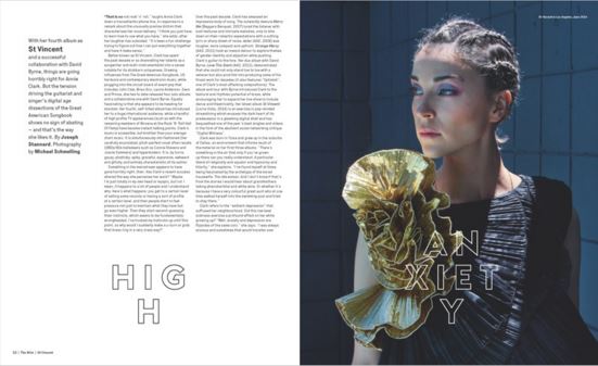
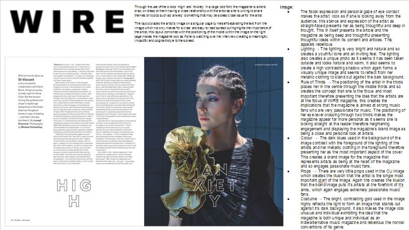
Image - Facial Expression/ Body Language
The facial expression and personal gaze of eye contact makes the artist look as if she is looking away from the audience, this stance and expression of the artist as straight-faced presents her as being thoughtful and deep in thought. This in itself presents the article and the magazine as being deep and thoughtful presenting thoughtful ideas within its content and articles.
This thoughtful and rebellious look to the spread is one that I hope to display in my own double page spread, while I wont be using an image where my model is not exhibiting a personal gaze I am hoping to create an image whereby my model's facial expressions exhibit a thoughtful and meaningful look.
Image - Lighting
The lighting is very bright and natural and so creates a youthful tone and an inviting feel. The lighting also creates a unique photo as it seems it has been taken outside and looks natural and warm, it also seems to create a high contrasting shadow which again forms a visually unique image and seems to reflect from her metallic clothing to stand out against the dark background.
I also wish to use lighting in my image which is extremely bright and creates a high contrast look in order to create a double page spread which looks interesting and reflect the thoughtful nature of the article.
Image - Positioning
The positioning of the artist in the thirds places her in the center through the middle thirds and so creates the concept that she is the focus and most important therefore presenting the idea that the artists are at the focus of WIRE magazine, this creates the implications that the magazine is aimed at strong music fans who are very passionate for music. The positioning of her eye level crossing through two thirds makes the magazine appear far more personal as it seems she is looking straight at the reader therefore heightening engagement and displaying the magazine’s brand image as being a close and personal look at artists.
Through the use of the positioning displayed in this spread whereby the artist's eye-level is positioned through the thirds in my own magazine combined with the personal gaze with which I wish to exhibit in my own magazine I hope to highlight a spread which is personal and resonates with the readers.
Image - Colour
The dark blues used in the background of the image contrast with the foreground of the lighting of the artists and her metallic clothing in the foreground therefore presenting her as the most important aspect of the cover. This creates a brand image for the magazine that represents artists as being at the heart of the magazine and so engages passionate music fans.
In my own magazine I will not be using similar dark colours as I wish to use a spectrum of bright vibrant colours which portray ideas of youthful vibrancy and a stand out attitude.
Image - Props
There are very little props used in the CU image which creates the illusion that the artist is the single most important p[art of the image. Again this creates the illusion that the brand image puts it’s artists at the forefront of it’s aims, which again engages extremely passionate music fans. I will be re-creating this idea in my own magazine by which the use of no props places the readers full engagement on the artist and places the music at the heart of the magazine, nothing else.
Image - Style
The bright, contrasting gold used in the image highly reflects the light to form an image that stands out against it’s dark background, it also makes the image look unusual and individual exhibiting the idea that the magazine is both unique and individual as an indie/alternative music magazine and rebellious the normal conventions of its genre.
I too would like to portray this high contrast and interesting look to my own image therefore to do so I will be using reflective and sparkling clothing and metallic makeup increasing the contrast using Photoshop.
Language
Through the use of the words ‘High’ and ‘Anxiety’ in a large bold font, the magazine is able to draw on ideas on them having a close relationship with the artist as she is willing to share themes on topics such as ‘anxiety’ something that may be a deep close issue for the artist.
In my own magazine I hope to create a similar emotional and personal style to the content within the article therefore I will focus on an article which focuses on similar deep and emotional themes.
Layout
The layout places the artist’s image on a singular page by herself separating the text from the image which not only makes for a clear and easy to read spread but highlights the importance of the artist, this layout combined with the positioning of the model within the image on the right page makes the magazine look as if she is watching over her interview creating a meaningful, impact and poignant style to the spread.
I am going to use this layout in my own magazine as I feel it makes the article clear and easy to read.
Magazine Analysis: NME Double Page
NME Double Page Analysis


Image – Body
Language/ Facial Expression
The facial expression and personal gaze of eye contact makes
the artist ‘grimes’ look as if she is looking directly at the audience. The
facial expression of ‘Grimes’ looks subversive and crazy illustrating her alternative
style and so the alternative e brand identity of the magazine. The positioning
of ‘Grimes’ on the left page creates the impression of dominance, as if she is
sitting on a throne, this theme of dominance not only reflect s her as a strong
female musician but also NME as a dominant music magazine and household name.
On the right page ‘Grimes’’ positioning and facial expressions appears so be
that of her being crushed by her own words in the interview, she seems to be
greatly affected by the interview which highlights the style of the article as
being a powerful and shocking one.
I too will be using
images throughout my magazine which illustrate the model as having a personal
gaze as I feel this represents the magazine as presenting content which gives a
close and personal insight into my readers’ favourite music and musicians.
Image - Lighting
The lighting is very bright and creates a youthful tone and
again juxtaposes the alternative impressions of the magazine created with its
other conventions again presenting a rebellious tone. The bright lighting also
forms a unique and stylistic image as it reflects off the sequins on the
costume and other areas of the costume to stand out again reflecting the idea
that NME stands out as a popular music magazine in comparison to its
competitors.
In my own magazine’s double page I am
planning to use similar bright lighting in order to create a youthful feel to
the images I use, I also hope to use similar ‘sparkly’ clothing and makeup not
only stylistically to reflect the light but also to give a psychedelic feel to
the look of my double page spread.
Image - Positioning
The positioning of the artist in the thirds, places her in
the centre through the middle thirds on the left page and so creates the
concept that she is the focus and most important therefore presenting the idea
that the artists are at the focus of NME magazine this creates the implications
that the magazine is aimed at strong music fans who are very passionate for
music.
In my own magazine I am planning use the rule of
thirds in the layout of my magazine by placing the models personal gaze between
a third to give a really eye-grabbing personal and emotive feel to the spread.
Image - Colours
The surreal psychedelic colour scheme of a tie-die blue and
cream house style creates a rebellious and unique tone reflecting the
alternative genre of the magazine. The pink used seem to create an
over-feminine tone in almost an ironic
way, this exaggerated ‘girly pop’
feel contrasts and juxtaposes not only with the branding of the magazine
but also the artist and so the irony presents connotations of rebellion
therefore representing the alternative genre of the magazine.
I hope to re-create this ironic feminine tone throughout my
magazine in order to give it a classic punk look, this rebellious look is
presented in order to reflect the rebellious nature of the alternative music it
features. The girly-pop, millennial-nostalgic blend to create a psychedelic
look I feel makes the spread very interesting and entertaining through its
stunning and strange visual presentation. I too hope to form a strange and
subversive look to my spread through costume and bright contrasting colours.
Image - Costume
The silver crown and sequin boots connotes idea of prestige
and as if the artist ‘grimes’ is a royal, this follows with the implications
that NME itself is the king/queen of the music magazine genre While I will be presenting silver reflective costume and
makeup in my own magazine this is mainly to create a visually interesting image
by reflecting the light rather than to highlight a level of prestige.
Language
Ideas of rebellion are further portrayed through the use of the expletive within the title of the article, a direct quote from the artist, this is shocking and illustrates the artist as being rebellious, it seems the magazine sensationalises this by using this quote as its title relaying the fact that the magazine will present these shocking sides to their artists despite the social stigma and taboo nature surrounding it. This not only presents the magazine as rebellious through presenting these ideas but also illustrates the upfront nature of the magazine, it seems despite the shocking statements the artists in NME make, the magazine will not censor or hide these words from its readers, it presents the truth and does not try to deceive its readers therefore presenting the magazine as trustworthy and truthful.
In my own magazine I will also be using expletives as I feel despite the fact that some may find this offensive the target audience of alternative music magazines (generally 16+ possibly even older) means that generally they are simply used to conform to the general conventions of the theme of rebellion in these types of magazines.
Layout - Font
The use of the bold, black jagged fonts are illustrated as
dominant and powerful and stylistically this seems to speak in terms of the
connotations associated with the weight of her words within the article which
reflect the article as strong and meaningful, this also forms the concept that
the article is shocking and so demonstrates the magazine as rebellious as it
seems to defy the neutral undertones of many articles.
I
too am planning on using weighted, almost grungy fonts in order to exaggerate the impact of the artist’s words within the article to create a deep an
emotional page and article.
Layout - Positioning
The layout, in some ways is presented as being conventional
in terms of the article’s text being separated into the three columns, this
means the articles text is easy to read and clear to readers and highlights a
clear separation between the heading, subtitle and main body of text.
I too will be adhering to this convention in my own magazine
however due to the constraints of only having 2 pages (rather than 5 in the
case of this article) my text will most likely be on one page and the image on
the other.
Magazine Analysis: Q Double Page
Q Magazine Double Page Analysis


Image –
Body language/Facial Expression
The artists (Coldplay) appear to have a personal gaze that
seems to look straight at the readers and this forms a more engaging piece
which despite focusing on a band which is internationally recognised still
presents a personal relationship with its readers through this, this eye
contact also implies of the personal style within the interview giving fans of
Coldplay (and music fans in general) a deeper insight into the group.
While I am planning to use a long to mid-shot image for the
images used in my double-page spread (due to the fact that the artist featured
in my article will be a solo artist therefore a better use of the space would
be to use an image by which readers are able to see the artist’s costume) I too
am hoping to use a personal gaze for the photograph I use and I will do this
throughout my magazine in order to present the idea that the magazine gives
readers a personal connection with the music and artists they are passionate
about.
Image -
Lighting
The lighting appears bright and almost natural and creates an
image where readers can very clearly see the group which makes them appear as
important again presenting the concept that it is the artists that are at the
heart of the brand.
While I am planning to use darker
lighting for my front cover in order to portray an air of mystery to both the
artist and the magazine which readers can only fulfil through reading the
magazine I am planning to use bright images for my double page spread to capsulate
the youthful essence of both the artist and the brand identity of the magazine.
Image -
Colour
The colours used in the image
and throughout the article display a rainbow of colours which creates a
visually interesting feature that
portrays a sense of youth and notions that the magazine is vibrant, the
messy-ness of the powder paints within the photography as well as the eroded N
used within the article implies a rebellious undertone which seems to reflect
the nature of the magazine as being an indie/alternative music focused print
rather than a pop based magazine, it also connotes ideas of multicultural
identity and other accepting modern cultural ideals and so implies of the
magazine as being culturally accepting and friendly. The modern ideas portrayed
reflect the prints’ brand identity as a modern music magazine for the modern
reader who possibly associates themselves with modern alternative views as well
as modern alternative music.
I feel this colour scheme
perfectly encapsulates the youthful tone to my magazine while also portraying
the modern and socially accepting ideology I want to create in my own magazine,
therefore I too will be using a rainbow colour effect for the scheme of my
double page spread however I am planning to use a spectrum of colours that is
slightly more psychedelic in order to highlight the alternative nature of the
magazine.
Layout –
Positioning
The layout of the text places the article in two columns, a
format which is not typically conventional for magazines (as they usually have
three columns) however this creates an interesting format which centres around
the large ‘N’ and the thoughtful quote in the centre. It places the images of
the band members and Chris Martin and their words at the centre of the article
creating the impression that the brand places its artists and the music at the
heart of its content resenting the notion that the magazine is passionate for
readers and artists who are passionate about music. The layout also appears to
place the main body of text on one page the larger images on the other creating
a clear and easy to read article.
While I am not
planning to use this layout in my own double page as I feel it is too
unconventional and not clean cut or clear I am planning on using a coloured
drop capital as I feel this draws attention to the article.
Language –
Embedded Quotes
The quote at the centre of the text reads “I feel blessed I’m
in a band that I really f***king love” here the magazine draws attention to
profanities and taboo words that some might possibly find offensive, however
due to the magazine being aimed at an older audience (16+). Despite this
possibly being more acceptable in a magazine of this nature, the article draws
attention to it therefore highlighting its rebellious identity.
I too am planning to use taboo swear words to reiterate the
rebellious nature of the magazine, I will also use the conventional embedding
of quotes between the text in order to draw the reader’s attention to the key
messages and quotes from the artist in the article.
Language
In the main article the magazine displays the use of
intrusive and personal words and phrases directly from the interviewee such as
‘Never give up’ ‘Why was he waking up feeling low after the explosive highs of
the night before?’ ‘tired of running away from his problems’ ‘I was nervous’
giving a deep and impactful article which presents fans and readers an emotional
and connecting feature portraying the exclusivity of Q being able to achieve
articles and features in which artists open up in their interview. Meanwhile
the use of the description of Chris Martin saying to the magazine ‘you’re in
the gang now’ and being described as ‘giving Q a friendly reminder’ illustrates
the magazine as not just being able to achieve an intrusive article but also a
friendly relationship with the artists it features in its magazine, a
relationship which no other magazine can achieve.
I too
am planning to create a personal and emotive article through choosing to create
an article which features personal and deep stories from the artist in order to
illustrate the passion my magazine holds for its artists, readers and music.
Subscribe to:
Posts (Atom)